
WORK
Brand Development / Brand Strategy

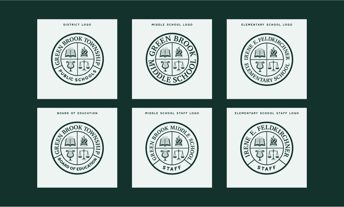
Green Brook Township Public Schools, located in Green Brook, NJ, serves the community through its elementary and middle schools. The district lacked a cohesive visual identity, with no official logo and existing branding that relied on disjointed clip art. This absence of a professional brand did not adequately reflect their strong commitment to education. Recognizing the need for a unified brand that would represent their dedication to education and the community, the district partnered with us to develop a professional and comprehensive branding system. Initially, we planned to create a single school district logo. However, after extensive research and stakeholder meetings, it became clear that the district required a broader logo system to represent the many facets of its schools effectively.

Visual Brand Identity
Public Education
Illustrator, Figma
2024
The school district’s branding was fragmented, outdated, and lacked consistency. With no official logo or design system, communication materials for the district and its programs failed to convey a unified identity. The challenge was to build a cohesive, professional brand that would represent the district as a whole, as well as its individual schools and programs, establish a sense of pride and unity among staff, students, and the community, and provide a scalable design system that could grow with the district’s needs.

Our goal was to create a brand identity that celebrated the unique spirit of Green Brook Township Public Schools while bringing a polished and professional look to all their communications. What started as a project to design a single logo and mascot evolved into a comprehensive branding initiative. We began with extensive research and stakeholder interviews to understand the district’s values, vision, and community. From there, we developed a series of mood boards to capture the essence of what the new brand would convey and to get agreement from all stakeholders on the new direction. From there a cohesive brand system was created to ensure that it would not only meet their desired needs but also provide flexibility for future growth.

The outcome was a full logo family and a robust brand guidelines document that aligned the district’s identity across all touchpoints. Key deliverables included:
Additionally, we developed a comprehensive Brand Guidelines document, which includes: Brand Voice: Guidance on tone and messaging to ensure consistency in communication and Visual Brand Elements: A detailed guide for logo usage, typography, color palette, and design applications.the broader brand system.


The new branding system has brought a fresh, cohesive identity to Green Brook Township Public Schools. For the first time, the district, schools, and programs are represented by a unified and professional design, fostering pride and connection within the community. The Brand Guidelines empower staff to maintain consistency across all materials, ensuring the longevity and adaptability of the new identity. The transformation has not only elevated the district’s image but has also set a strong foundation for future growth and engagement.
Next Steps: Completion of mascot logos in Phase Two to further amplify school spirit and strengthen the district’s visual identity.
RELATED

Follow Us


